|
|
Computing and Graphing a Regression Line
From NeoWiki
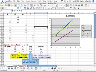
In NeoOffice Calc, it is possible to calculate the slope and the Y-intercept of a linear regression line, starting from a set of statistical data. Furthermore, you can get the set of data points and the regression line on the same chart.
Calculating parameters of the linear regression
- Enter your data in two columns of a spreadsheet, e.g. A and B, with headers X and Y. Thus the matrix of Y values is (B2:Bn) and the matrix of X values is (A2:An), if you have a set of n-1 data (X,Y).
- Click in an empty cell to select it.
- Click the Function Wizard icon (to the left of the sign Σ). The Function Wizard window opens. In the Category drop down menu, choose Array; then choose LINEST in the box below the drop down and click Next.
- In the data_Y field enter B2:Bn, in the data_X field enter A2:An (you can use the keyboard or click the corresponding cells to select them), you can leave the Linear_type field empty.
- If you don't fill the stats field, you will get the slope of the regression line and its intercept with the Y axis. If you fill that field, you will get some additional values (click Help in the Function Wizard window for more information and to see an example which explains in detail how to use the LINEST function).
- If you need only the slope of the linear regression line, you can use the SLOPE(data_Y;data_X) function, if you need only the point at which the line intercepts the Y axis, you can use the INTERCEPT(data_Y;data_X). Those two functions are available in the Category> Statistical drop down menu in the Function Wizard window.
Graphing the linear regression line
valterb provided these instructions for graphing a linear regression line in this post at trinity.
- Enter your data in a spreadsheet, in two columns, e.g. A and B, with headers X and Y. Thus the matrix of Y values is (B2:Bn) and the matrix of X values is (A2:An), if you have a set of n-1 data (X,Y).
- Select the whole set of data then choose Insert > Chart.
- Be sure that the selected cells contain the desired data.
- Click the Next button, choose the chart type called "XY chart" then click Next.
- Choose the variant you prefer (symbols only, lines with symbols, etc) then click Next and choose the chart title, legend, etc.
- Click Create. A chart appears in the spreadsheet.
- Select it and go to the Insert > Statistics menu.
- In the Regression curves section on the right, click the Linear regression icon and the OK button.
You can choose another regression type, display an error category (Variance, Standard deviation …) and display an error indicator on the chart.
Note 1: If the origin of the axes does not belong to the interval of your data, you can increase the X axis by clicking on the chart and choosing the Format > Axis > X Axis > Scale menu, then in the Minimum section deselect the Automatic option and type the value you wish. Repeat those operations with the Y axis.
Note 2 : You can graph several regression lines on the same chart. For instance, in order to graph three straight lines, enter all the values of X in column A, then enter the values of Y in three columns, B, C, D, with headers Y1, Y2, Y3. The corresponding values of X and Y must be on the same line. So you get three couples of matrices, for example (A2:A6) (B2:B6), (A7:A12) (C7:C12) and (A13:A17) (D13:D17). Select the whole set of data and insert a chart. Complete as indicated in the "Graphing the linear regression line" section. The three straight lines are of different color on the chart. Thanks to valterb for this additional information.
Note 3 : Remember to include the first line of the table, which contains the values x, y1, y2, y3 or whatever values you want, in the selected data. Otherwise the legend will display Column A, Column B, Column C, etc. Don't insert numbers in the first line.

