|
|
Creating Calc Templates
From NeoWiki
If you often use the same Calc functions, it might be wise to create your own templates. They can be used like templates created in Writer. But you have to change the data, the data range and, if any, the charts.
This article provides three examples of such templates.
Contents |
Creating the template
Histogram
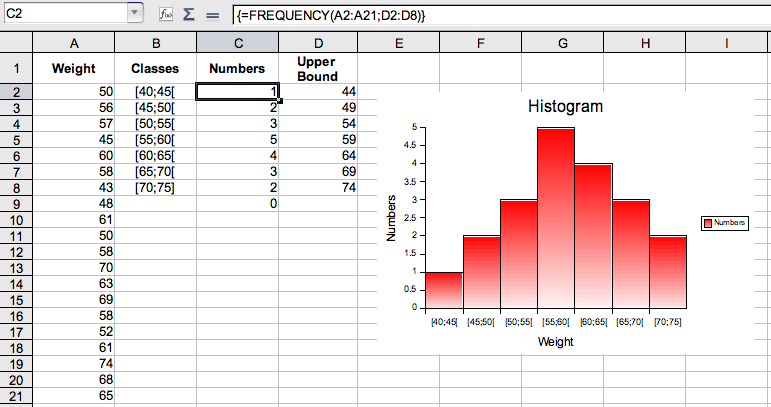
Let us suppose you want to plot the histogram of the weights of a sample of 20 persons.
- Open a new Calc document.
- Enter the titles Weight, Classes, Numbers and Upper Bound in cells A1, B1, and D1
- Enter the data series in the range A2:A21.
- In the range B2:B8, enter the classes with equal width: [40;45[, [45;50[, etc. [70;75].
- Select the cell D2. Enter the upper bound of the first class, i.e. 44.
- Fill the range D2:D8 as described in the Selecting and Filling a Cell Range page.
- The cells contain the values 44, 49, etc. until 74.
- Select the range C2:C9 (you must select one cell more than the class ceiling).
- Enter the formula
- =FREQUENCY(A2:A21;D2:D8)
Press the Command-Shift-Return keys.
- Select the range B1:C8.
- Go to the Insert menu, then choose Chart….
- The AutoFormat Chart window opens. Check the selected range. The two First row as label and First column as label boxes must be selected.
- Click on Next>>.
- Select Columns in the Choose a chart type section , it's the default selection. You can check Show text elements in preview.
- Click on Next>>.
- In the Choose a variant section, select Normal.
- Uncheck the Y axis box in the Grid lines section.
- Click on Next>>.
- Give the chart and the axis a title.
- Click on Create.
- The chart is selected in edit view. It doesn't match the chart you want for an histogram. We need to modify it.
- Increase the width by clicking on the little black square, in the right lower corner, and dragging the cursor until the class titles appear on a single line.
- Double-click on a column of the chart. The Data Series window opens.
- Click on the Options tab.
- In the Settings section, set Spacing to 0%. Leave Overlap to the default value 0%.
- If you don't like the area color, click on the Area tab, choose a color in the drop-down menu. You can add a gradient or transparency by clicking on the Transparency tab.
- Click on OK.
Cumulative Frequency
- Open a new Calc document.
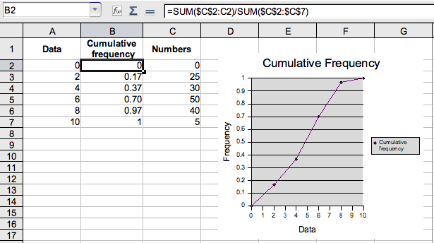
- Enter Data, Cumulative Frequency and Numbers in the cells A1, B1 and C1.
- Fill the range A2:A7 with the values 0, 2, etc. 10.
- Fill the range C2:C10 with the values you wish for the corresponding numbers.
- In the cell B2, enter
- =SUM($C$2:C2)/SUM($C$2:$C$7)
- press the Return key.
- Fill the range B2:B7, by using the method described in the Selecting and Filling a Cell Range page.
- Select the range A1:B7. Go to the Insert menu, then choose Chart….
- The AutoFormat Chart window opens. Check the selected range. Only the First row as label box must be checked.
- Click on Next>>.
- In the Choose a chart type section, select XY Chart.
- Click on Next>>.
- In the Choose a variant section, select Lines with symbols (it's the second icon from the left).
- Click on Next>>.
- Give the chart and the axis a title.
- Click on Create.
Linear Regression
- Open a new Calc document.
- See the method described in Computing and Graphing a Regression Line in NeoWiki.
- You can change the width and the color of the regression line
- Double-click on the chart, then on the line.
- Set the value of these parameters in the Line window which opens.
- You can calculate the slope and the Y intercept of the line. If the data range is the range A2:A10, enter in two empty cells
- =SLOPE(B2:B10;A2:A10)
and
- =INTERCEPT(B2:B10;A2:A10)
Saving these Documents as Templates
- Choose File, then Templates and Save….
- Select My Templates. Give your document a title, for example "Histogram", "Cumulative Frequency" or "Regression Line" .
- Click OK.
- This document is saved in the Library/Preferences/NeoOffice-2.2/user/template folder.
Using Templates
- Go to the File menu, select New then Templates and Documents.
- The Templates and Documents - My Templates opens.
- Select the template you desire, Histogram, Cumulative Frequency or Regression Line, and click on Open.
- Your template opens. The data needs to be changed.
To do that, follow the method described in the Changing the Data Range of a Chart article.
This article in other languages: Français


