|
|
Plotting Curves in Calc
From NeoWiki
Revision as of 13:12, 29 May 2007
In many scientific documents, we are led to graph curves. Neooffice allows you to easily perform this task by using charts provided by Calc.
Contents |
Plotting a single curve
Let us plot the parabola defined by the equation f(X)=X^2+X+1 on the interval [-3;3].
Setting up the data
Open a new spreadsheet in NeoOffice Calc. The first column will show the values of X, the second one the values of f'(X).
- In cell A1 enter X, in cell B1 enter f(X) and in cell A2 enter -3.
- Select the cell range A2:A8 and choose the Edit menu then Fill and Series…
- In the Fill Series window choose
- Direction > Down
- Series type > Linear
- Start value = -3
- End value = 3
- Increment = 1
- Click OK
- Select the cell B2, enter "=A2*A2+A2+1" (without quotes) and press Return
- Select the cell range B2:B8 and choose the Edit menu then Fill and Down. The selected cells now contain the values of f(X).
You can also fill these ranges by using the drag and fill method as described in the Selecting and filling a cell range page in this wiki.
Plotting the curve
- Select the cell range A1:A8 and choose the Insert menu then Chart…
- In the AutoFormat Chart window, check First row as label then click Next
- Choose XY Chart, click Next
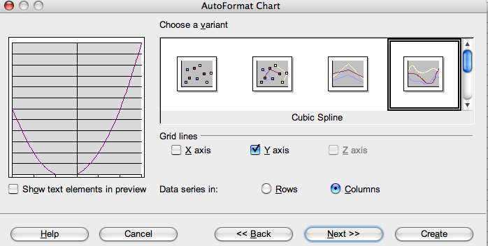
- Choose Cubic Spline, click Next
- Give a title to your chart and both axes X and Y. Uncheck the Legend box, click on Create
This chart must be modified because the curve does not appear properly.
- Double-click on the chart in order to edit it, then double-click on the Y axis to select it. The Y Axis dialogue opens. Click on the Scale tab
- In the Scale axes > Minimum section, uncheck the Automatic box and set up the minimum value to 0. Click OK.
If it were necessary, you could set up the other values in the Scale section in the same manner.
Customizing the chart
- Double-click on the chart, then right-click or Ctrl-click
- In the context menu, you can modify the border, the background color, the chart wall, the grid (e.g. you can replace the continuous line with a fine dashed line)
- Double-click on the curve. The Data Series dialogue opens
- Click on the Line tab and choose the color, the width you wish. Click OK
- If you prefer that the Y axis title appears horizontaly, go to the Format menu, then choose Title and Title (Y Axis). Click on the Alignment tab, set the Text direction to 0°.
- Click OK
Plotting several curves on the same chart
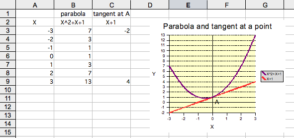
We are going to modify the chart in order to draw the parabola and its tangent at the point A(0,1). The equation of this tangent is Y=X+1.
Let us input X, X^2+X+1 and X+1 in the cells A2, B2 and C2.
Thus we enter in the cells C3 and C9 the values -2 and 4 respectively.
- Select the cell range A2:C9 and go to the Insert menu then choose Chart…
- Follow the same steps as in the previous case, but check the Legend box
- If you wish, modify the chart as you did in the previous section.
Inserting text into the chart
You can insert text into a chart. For example we are going to add the letter "A" close to the contact point between the parabola and its tangent.
- Open the Draw toolbar. Go to the View menu, choose Toolbars and Drawing
- Click on the icon which shows a rectangle: the pointer changes to a cross symbol
- Draw a little rectangle near the contact point A. This rectangle is selected
- Click on the text icon which shows a T
- Click into the rectangle which is still selected
- Type "A". Select this letter to change, if you wish, the font, size, color
- Select again the rectangle by clicking inside it. The 'Drawing Object Properties toolbar appears in the top of the window. If not, go to the View menu then choose Toolbars and Drawing Object Properties.
- In the Color drop-down menu, choose Invisible
- In the Line Style drop-down menu, choose Invisible
- Cick outside the chart.
- Note 1 If you move the chart in the sheet, the inserted text doesn't follow it. You will have to replace it by hand in the appropriate location.
- Note 2 You can insert these charts into a Writer document or an Impress presentation by copying/pasting. In order to insert the text too, you have to select the cell range that contains the chart and not the chart alone.
Particular cases
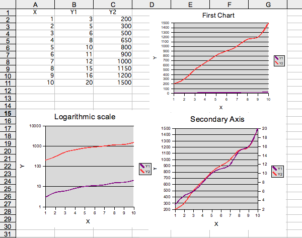
If the Y values are very different from one another, you can use two methods to enhance the chart readability:
- 1. Several curves are present in the chart
You can use the logarithmic scale, or a secondary axis:
Logarithmic scale
- Double-click on the chart, then on the Y axis
- The Y Axis window opens
- Click on the Scale tab
- Check the Logarithmic scale case
- Click OK.
2nd Y axis
- Double-click on the chart, then on one of the two curves
- In the Data Series window, click on the Options tab
- Click on 2nd Y axis
- Click OK
- 2. A single curve is present in the chart
Use the logarithmic scale.
Related articles
Computing and Graphing a Regression Line


