|
|
Creating a Gantt Chart
From NeoWiki
Revision as of 12:41, 8 May 2007
A Gantt chart is a bar diagram that allows you to represent graphically the diverse tasks necessary for the realization of a project and to see the state of progress of this project.
The following example shows how to create such a chart in Calc.
Entering Project Data
Open a new Calc document
- Column A contains the name of the tasks you will complete. Leave empty the cell A1.
- Column B contains the start dates of the various tasks. Enter Start Date in cell B1
- Column C contains the number of work days already completed. Enter Completed in cell C1
- Column D contains the number of work days still to be completed. Enter Remaining in cell D1
- Column E contains the end date of each task. Enter End Date in cell E1.
- N.B The values contained in this column can be calculated by entering in the cell E2 the formula "=B2+C2+D2-1" then pressing the Return or Enter key. Next you have just to select the range E3:E5 and choose the Edit menu, the Fill sub-menu and the Down option. Be sure that the cells are in Date format.
Creating the Chart
- Select the cell range A1:D5
- Choose the Insert menu then the Chart sub-menu
- In the dialog that opens, verify the selected range and leave checked First row as label and First column as label. Click Next
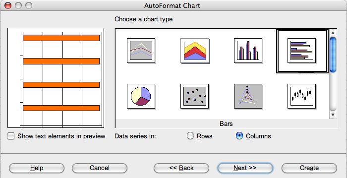
- Choose the bars chart and click Next
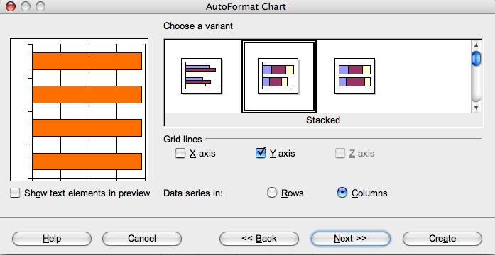
- Select the Stacked option and click Next
- Give a title to your diagram and to the axis
- N.B In this type of diagram, the X axis is vertical. It is the axis on which you note the various tasks.
- Click Create
The chart that appears does not match our wait. We have to edit it .
Formatting the Chart
- Double-click on the chart, then right click (or Ctrl-click) in it
- In the context menu, choose Axis then Y Axis
- Click on the Scale tab
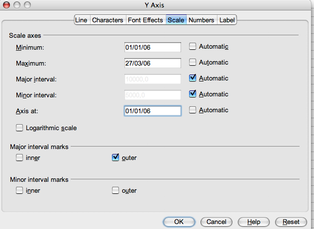
- Uncheck Automatic in the Minimum, Maximum and Axis at sections. Set up the minimum to start date, the maximum to end date and the axis origin to start date, as showed in the picture below:
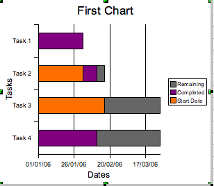
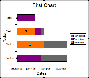
- We get the following chart:
Now we are going to remove the areas of the chart which correspond to the date column. They are colored orange in the chart.
- Double-click on the chart
- Click on the part of the task axis which is placed in the "Task 1" area. The date column must be selected
- Click on Object Properties…
- In the dialog Data Series, choose the Area tab and choose None
- Then choose the Borders tab and in the Style drop-down menu choose Invisible
- Click OK
- The part of the chart corresponding to the following column (Completed) is automatically selected.
You can modify the background colors of the various data series by following the steps above, and choosing the colors you wish.
If the data contained in the columns C and D are changed, the chart is automatically updated. That allows you to follow easily the project evolution.
You can copy/paste your chart in any Writer or Impress document.

