|
|
Talk:NeoOffice 2.1 Press Kit
From NeoWiki
| Revision as of 02:56, 28 August 2006 (edit) Sardisson (Talk | contribs) (Reply) ← Previous diff |
Revision as of 03:01, 28 August 2006 (edit) (undo) Sardisson (Talk | contribs) (replies) Next diff → |
||
| Line 1: | Line 1: | ||
| - | Did you not want these? (I'm heading out.. so feel free to continue editing. I won't touch it. | + | ==Images questions== |
| - | + | Did you not want these? (I'm heading out.. so feel free to continue editing. I won't touch it. | |
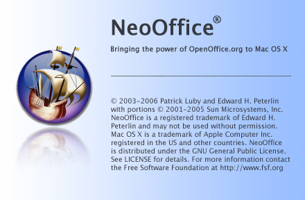
| {{imagebox|[[image:Neo2splash.jpg|NeoOffice Splash (JPG)]]|440x228, 72 dpi, 54.1 KB|JPEG<br> (Splash Screen)}} | {{imagebox|[[image:Neo2splash.jpg|NeoOffice Splash (JPG)]]|440x228, 72 dpi, 54.1 KB|JPEG<br> (Splash Screen)}} | ||
| {{imagebox|[[image:Neo2FinderIcons.jpg|NeoOffice Finder Icons (JPG)]]|624x428, 72 dpi, 80.8 KB|JPEG<br> (Finder Icons)}} | {{imagebox|[[image:Neo2FinderIcons.jpg|NeoOffice Finder Icons (JPG)]]|624x428, 72 dpi, 80.8 KB|JPEG<br> (Finder Icons)}} | ||
| {{imagebox|[[image:Neo2MiniIcons.jpg|NeoOffice Mini Icons (JPG)]]|173x322, 72 dpi,54.1 KB|JPEG<br> (16x16 Mini Icons)}} | {{imagebox|[[image:Neo2MiniIcons.jpg|NeoOffice Mini Icons (JPG)]]|173x322, 72 dpi,54.1 KB|JPEG<br> (16x16 Mini Icons)}} | ||
| + | <br style="clear: both;"> | ||
| --[[User:Waldo|Waldo]] 21:15, 27 August 2006 (CDT) | --[[User:Waldo|Waldo]] 21:15, 27 August 2006 (CDT) | ||
| - | == Reply == | + | === Reply === |
| That section is for "logo-type" or "brand" images to use in reviews and coverage, so the icons don't really fit. No one's going to use an icon alone (or even a dozen of them "alone") in coverage. The splash is borderline. | That section is for "logo-type" or "brand" images to use in reviews and coverage, so the icons don't really fit. No one's going to use an icon alone (or even a dozen of them "alone") in coverage. The splash is borderline. | ||
| Line 15: | Line 16: | ||
| What would be a really cool way to show off the icons is to do something like a Spotlight content search and get a capture of that window; I'd like something like that for the Screenshots page, actually. | What would be a really cool way to show off the icons is to do something like a Spotlight content search and get a capture of that window; I'd like something like that for the Screenshots page, actually. | ||
| + | |||
| + | —[[User:Sardisson|sardisson]] 22:01, 27 August 2006 (CDT) | ||
| + | |||
| + | ==Content== | ||
| + | Also, did you consider a new Press Release / Announcement? | ||
| + | --[[User:Waldo|Waldo]] 21:15, 27 August 2006 (CDT) | ||
| + | |||
| + | For 2.0 Final, we need a nice big one. For 2.0 Beta 3's public release, I'd like something like the [[NeoOffice 1.2 Announcement]] but a bit bigger since, after all, it's AQUA :) I'll make a new page with the 1.2 text in there and maybe you can edit some when you get back ;) | ||
| + | |||
| + | —[[User:Sardisson|sardisson]] 22:01, 27 August 2006 (CDT) | ||
Revision as of 03:01, 28 August 2006
Images questions
Did you not want these? (I'm heading out.. so feel free to continue editing. I won't touch it.
--Waldo 21:15, 27 August 2006 (CDT)
Reply
That section is for "logo-type" or "brand" images to use in reviews and coverage, so the icons don't really fit. No one's going to use an icon alone (or even a dozen of them "alone") in coverage. The splash is borderline.
We should perhaps emphasize the screenshots page more for people looking for pre-made screenshots, though.
What would be a really cool way to show off the icons is to do something like a Spotlight content search and get a capture of that window; I'd like something like that for the Screenshots page, actually.
—sardisson 22:01, 27 August 2006 (CDT)
Content
Also, did you consider a new Press Release / Announcement? --Waldo 21:15, 27 August 2006 (CDT)
For 2.0 Final, we need a nice big one. For 2.0 Beta 3's public release, I'd like something like the NeoOffice 1.2 Announcement but a bit bigger since, after all, it's AQUA :) I'll make a new page with the 1.2 text in there and maybe you can edit some when you get back ;)
—sardisson 22:01, 27 August 2006 (CDT)

